
Tutorial Progress
Creating Style Sections
Lesson Contents
- Breaking down style documentation
- Creating sections in the living style guide
Video Lesson
Written Lesson
Creating “style” sections is as simple as using the @styles tag to break down your stylesheet doc into sensible chunks. Doing this will allow you to talk about and understand your code better.
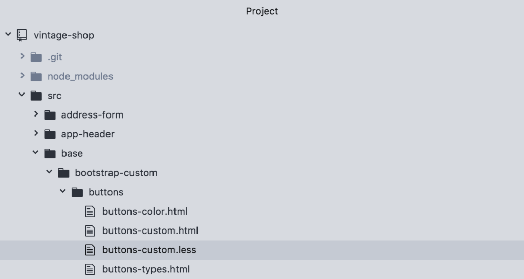
Let’s continue with the exercise from the previous lesson using the buttons-custom.less file:
In this stylesheet we have styles that define buttons in general, regardless of the markup that is used (either using a <button/> vs <a/> tag). And then we have definitions of color.
With the @styles tag we can break down the color definitions into their own section, not only to talk about them separately, but also to be able to hyperlink to that section directly. This is how it works:
/**
  *  @stylesheet buttons.less Buttons
  *  @parent styles.base
  *
  *  @description
  *  Global style definitions for all button elements.
  *  @demo src/base/bootstrap-custom/buttons/buttons-types.html
  */

.btn {
   display: inline-block;
   ...
}

/**
  * @styles buttons-colors Button Colors
  *
  * @description
  * Buttons can be displayed in the following colors:
  * @demo src/base/bootstrap-custom/buttons/buttons-color.html
  */

@btn-default-color: #333;
Right after the .btn styles and before the @btn variables we added a new comment block using the @styles tag. Then, we give it a unique name button-colors and then the title of Button Colors. Also we can give it a @description and add a @demo to only show the button colors.
When we run this again and view it in the browser we should see this:
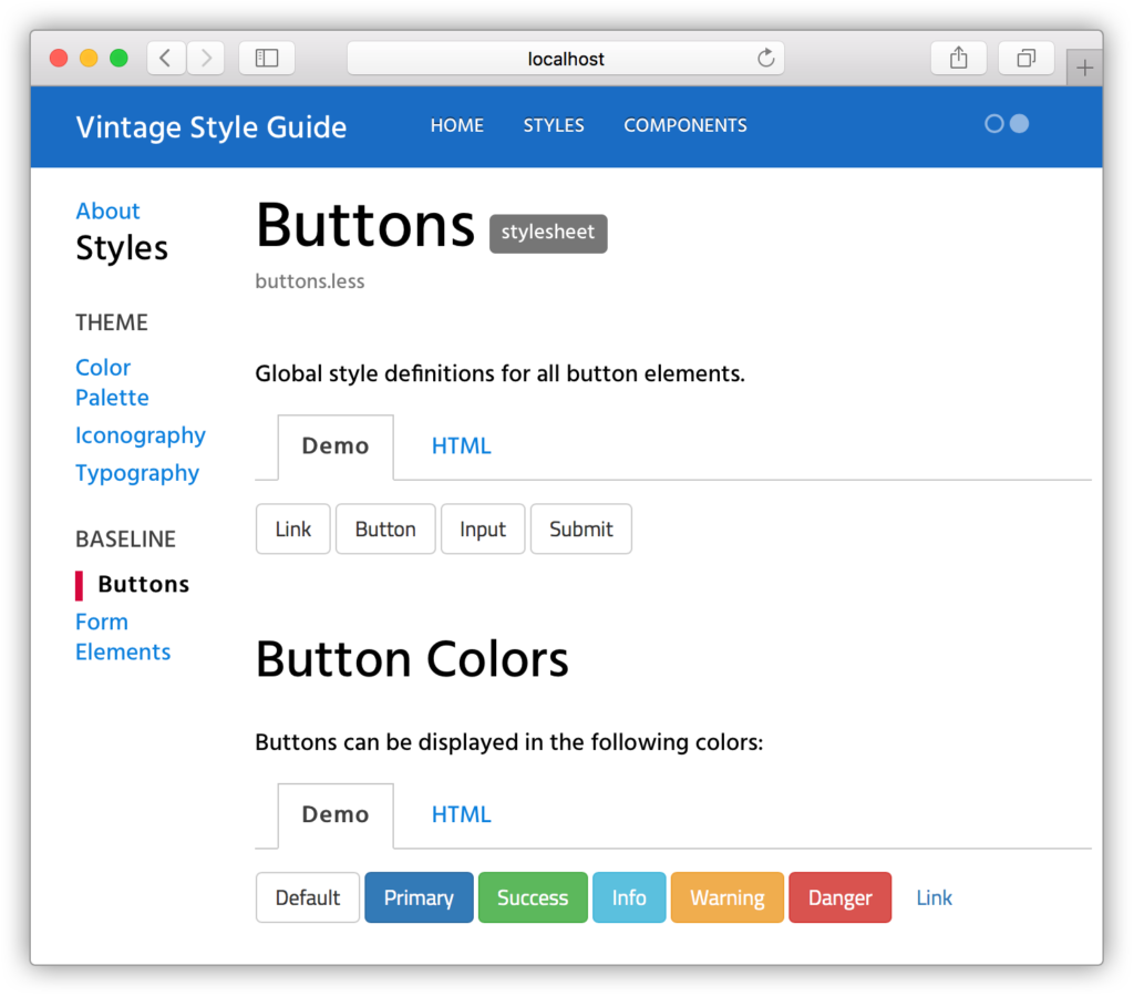
Notice that the new comment block is now a section within the “Buttons” doc. But also you can now point directly to it using this url: http://localhost:8080/styleguide/buttons-colors.htm
We find this very useful because you can direct people to a specific section in the style guide, vs saying: “it’s in x page, under x section. You need to scroll and blah, blah, blah”. Instead you can provide a direct link, and end of the story.
Bitovi can help you create a living style guide for your project and provide training for your team to make it part of your workflow, without disrupting your team’s workload and efficiency.
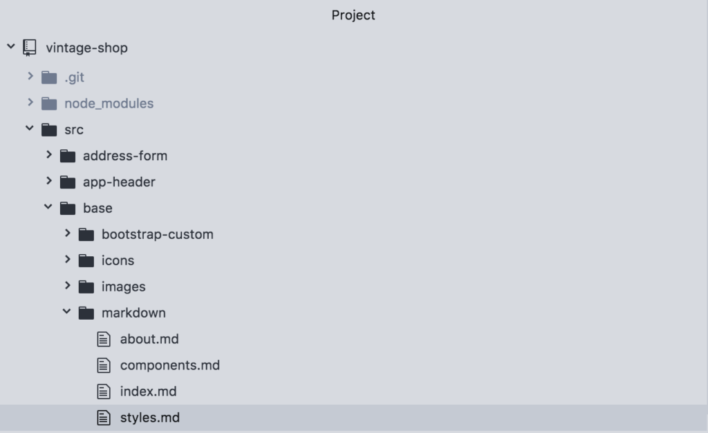
Additionally you can also create sections or groups in the sidebar of the style guide. For this, open the file styles.md, located in the markdown directory.
Inside of this file you will notice here a new tag called @group:
@page styles Styles
@group styles.theme 0 Theme
@group styles.base 1 Baseline

The styles shown in this section show how elements are styles with definitions from the Bootstrap framework, in addition to any customizations made for this specific project. Therefore they will be available for use in any part of the application.
Now let’s break down the second line:
@group
The @group tag allows to create a section in the sidebar that appears for the “parent” section. In or example, the groups: “Theme” and “Baseline” will appear under the parent section of “Styles”.
styles.theme
This is the unique name for the group. A good practice to follow here is to use the name of the parent section, in this case styles as a namespace. In this way, if you want to create another group with the same name, but under a different section, the name of the group will remain unique.
0
This is the order in which the group should appear, which starts with 0. If no order is assigned, then the list of groups will be shown in alphabetical order.
Theme
This is the actual name that will show in the sidebar, so you can use multiple words with spaces and other characters.
To see groups in action, let’s add a new group as follows:
@page styles Styles
@group styles.theme 0 Theme
@group styles.base 1 Baseline
@group styles.forms 2 Forms

The styles shown in this section show how elements are styles with definitions from the Bootstrap framework, in addition to any customizations made for this specific project. Therefore they will be available for use in any part of the application.
If you run the docs and refresh the browser, you should see the new section:
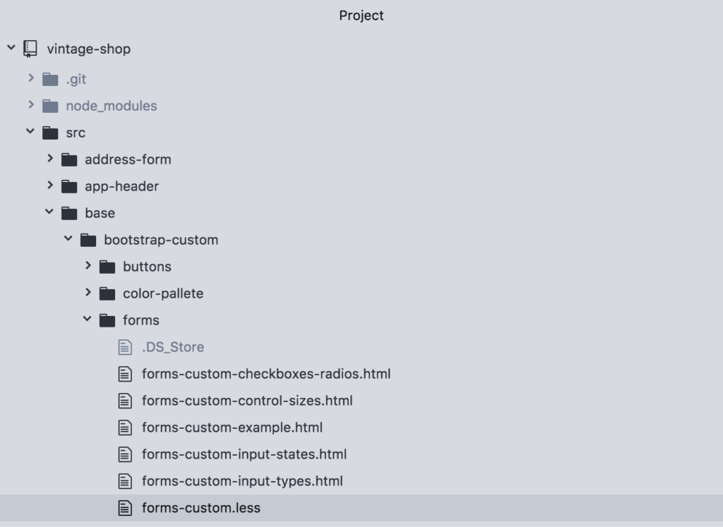
Finally, let’s add a doc under this new section. So open the file forms.less located under base/bootstrap-custom/forms:
And on line 3, replace styles.base for styles.forms.
/**
* @stylesheet forms-custom.less Form Elements
* @parent styles.forms
*
*
**/
Then run the docs and refresh the browser. You will now see the Form Elements doc under the group Forms in the sidebar.
And this wraps up our tutorial on Creating a Living Style Guide. Up next is the tutorial summary.
[wpforo item=”forum” id=”25″]