
Tutorial Progress
Modularizing Your Designs
Lesson Contents
- Identifying design components
- Styles vs iteraction patters
Video Lesson
Written Lesson
Picture this: You have come up with a great user flow, put together mockups and prototypes to illustrate the interactions, and documented every single part. Chances are that your designs already follow a style guide, which could put you at a great advantage. If not, no worries, we will be covering that in another course.
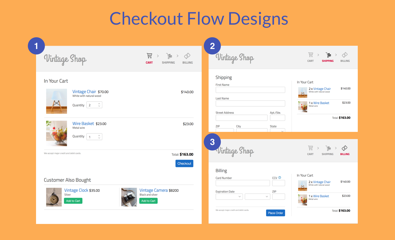
Full renderings available at: http://h4nmgn.axshare.com
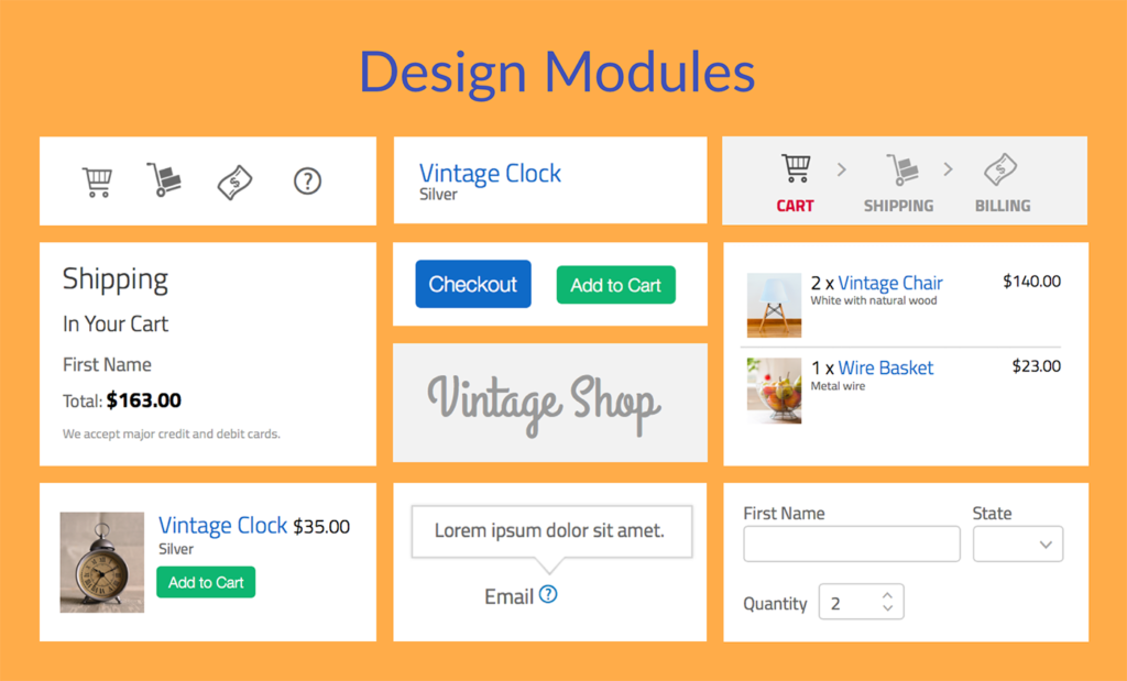
Now, step back and start mapping out at a high level the main parts of your design solution. These parts could be the interaction points where certain things are accomplished. For example, a checkout flow could look like this.
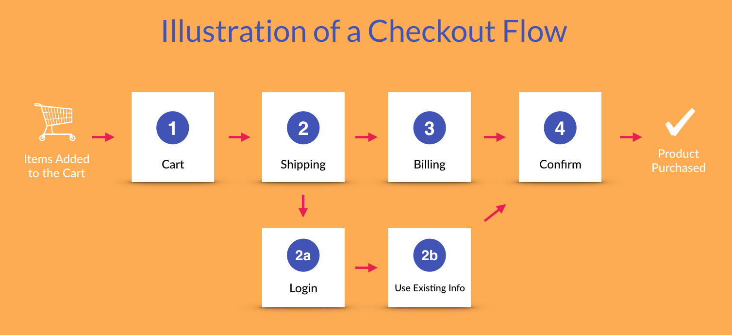
But hold your guns! These are not modules yet. To get to there, we need to identify the UI elements that are persistent in the flow, such as:
- the checkout steps indicator,
- form elements used to enter information,
- the representation of products in the cart,
- the representation of related products that others have bought,
- policies about the purchase,
- help text,
- messages and alerts.
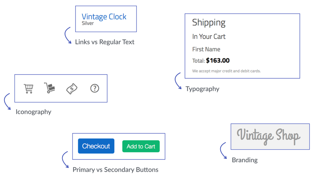
Styles persistent in the UI
Digging a little deeper, we will also find styles and interaction patterns. In the case of styles you can observe:
- The colors used to denote:
- error, success, warning and information messages;
- primary versus secondary actions;
- inactive versus selected versus disabled states;
- links versus regular text;
- branding;
- Typography used to display different types of content:
- font size for laying out information hierarchically;
- font types for highlighting messages or providing additional information;
- lists to summarize information;
- Iconography used to convey visual meaning and quickly reference to common actions.
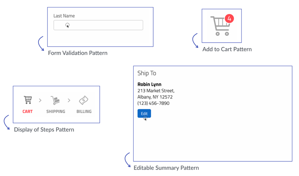
Interaction patters
Aside from styles, we can also observe interaction patterns. These differ from styles as they are solutions to common design problems. For example, showing a help text that shows on demand is a common solution for answering questions while keeping the screen uncluttered.
Other interaction patterns are:
- showing upcoming steps disabled;
- showing previous steps enabled so that the information can be edited;
- displaying summaries that can be edited;
- validating information once the user has clicked out of the field;
- providing help text on rollover;
- updating the cart once a selection has been made.
Bitovi can help you design and build user interfaces in a modular way. Learn more.
Once the design has been broken down into all of these smaller pieces, we will finally have our modules. At this point, it’s easier to see that a lot of them apply not only to the checkout process, but to many other areas of the application. With a modular design approach, these modules can be created so that they are used in this particular design as well as in future ones.
Up next, we will learn about Using Atomic Design and how does it fit to the process described in this lesson.
[wpforo item=”forum” id=”15″]