Tutorial Progress
Using Atomic Design
Lesson Contents
- A practical example of atomic design
Video Lesson
Written Lesson
Atomic design, by Brad Frost, is a methodology that can accelerate the process of creating modular designs. This methodology analyzes the relationships between the different parts of the system and how they interrelate, using chemistry as a metaphor.
Now let’s apply Atomic design to the exercise we did in the previous lesson. But in this case we will do in reverse. And instead of starting at a high level, we’ll start with the smallest modules in the system: the atoms.
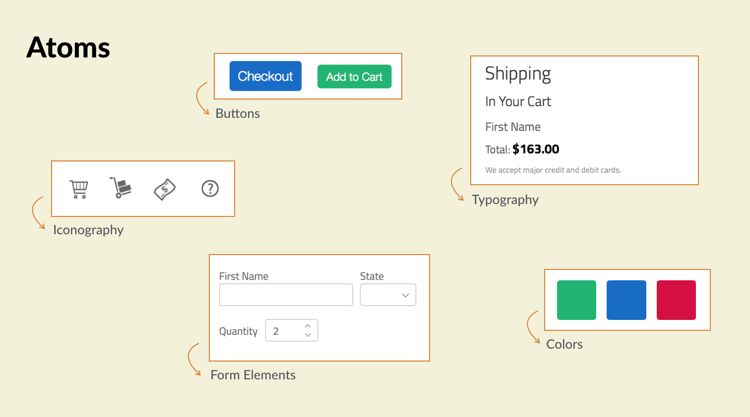
Atoms are the building blocks of your application. In our example they are the different UI elements by themselves (such as buttons, form elements, and labels), as well as the styles defined in typography, color, and iconography.
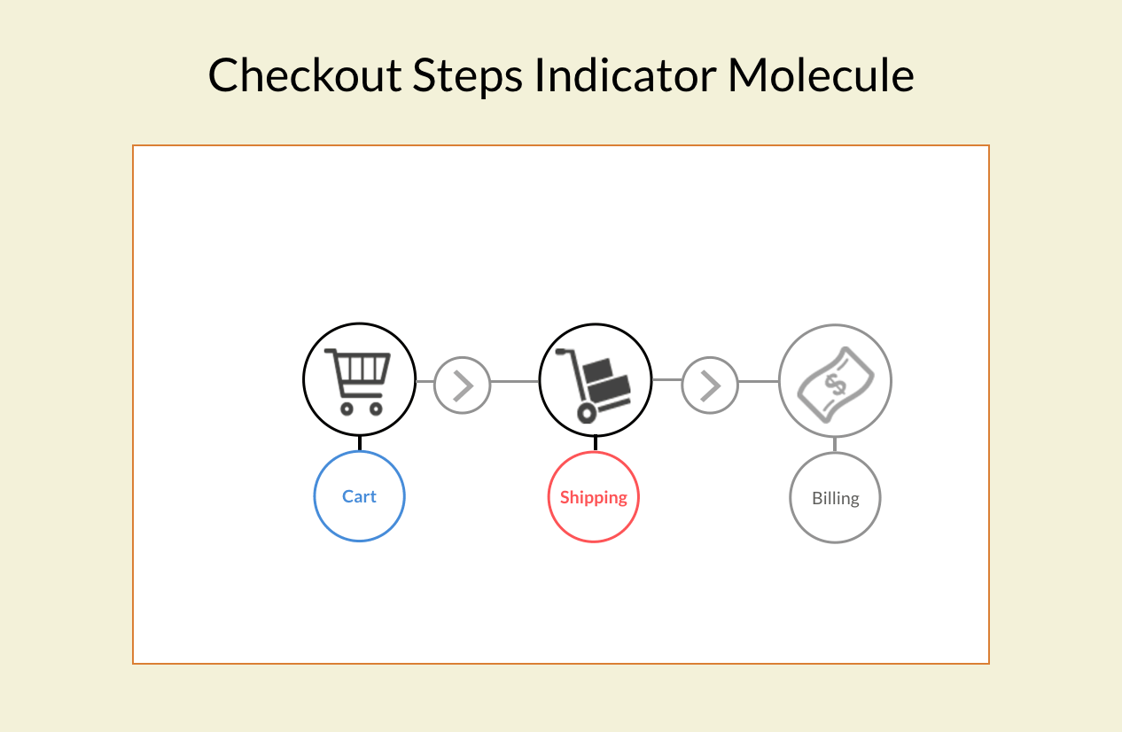
Once atoms are bind together, they grow in complexity and turn into molecules, which provide more functionality. In our example the “checkout steps indicator” and the “related products” modules are molecules. Let’s view the checkout steps indicator in more detail:
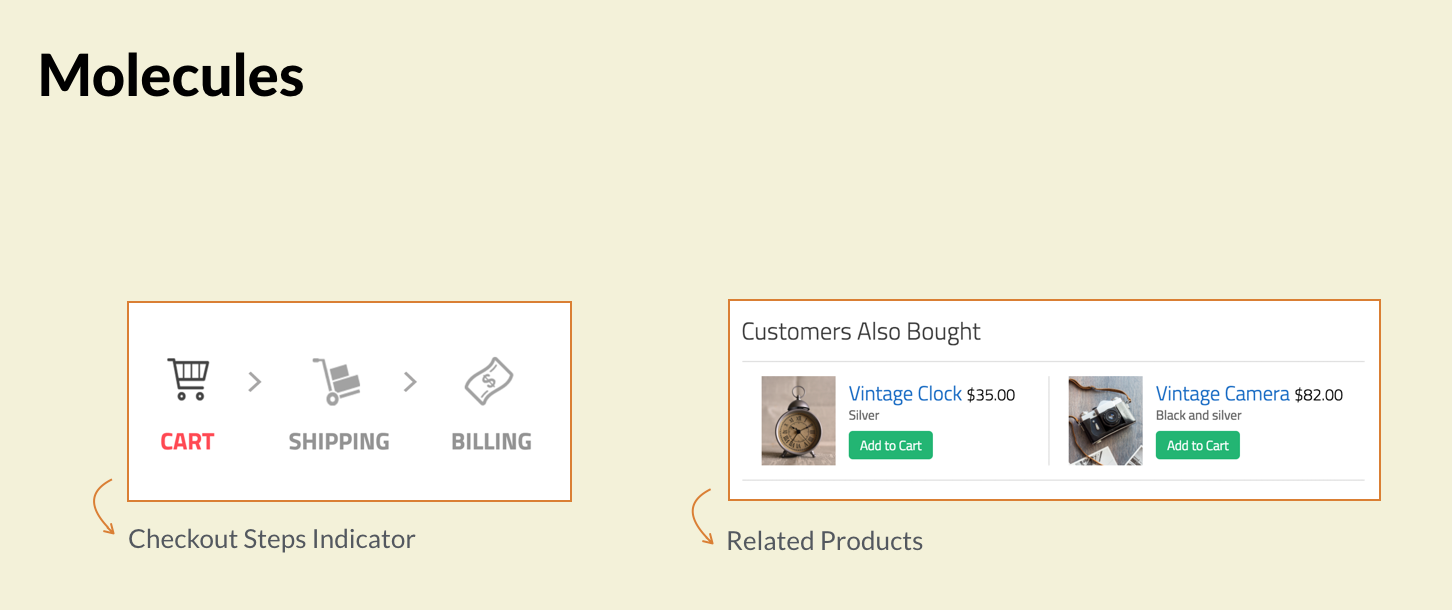
The atoms, or inner modules are:
- The icons used for each step,
- The icons used to connect the steps,
- And The text used under the icons
But also:
- The colors used to differentiate the active from the inactive steps,
- And the typography used, which involves the font family, the size, and the style
These atoms by themselves are pretty basic, but once grouped together provide meaning and functionality. Allowing the user to know what’s the current step they are in, which step lays ahead, and a way to navigate those steps.
As in nature, when interfaces grow in complexity and molecules bind together the result are organisms. These organisms translate in the UI as defining sections of the application. And are more complex and contain more interactions. From our example, the “app header”, as well as the “cart”, “mini-cart” and the “shipping” and “billing” forms are organisms.
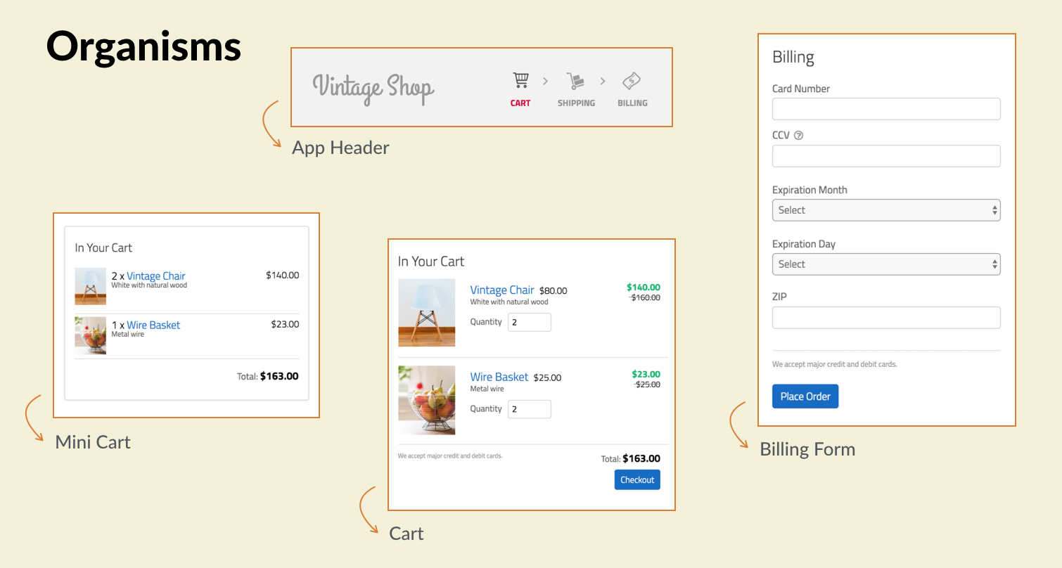
From a modular design perspective, you can see how organisms are systems themselves, are comprised by other modules (like molecules) and can have their own rules (like atoms). For example, in our design, links are simply blue, and besides color, they inherit the styles of text where the link is placed. However, when links are placed in the “checkout steps indicator” new rules or styles are defined to convey the specific functionality that this molecule provides. Furthermore, when this molecule is placed in the app header, the color and size of it is directly related with the styles of the app header.
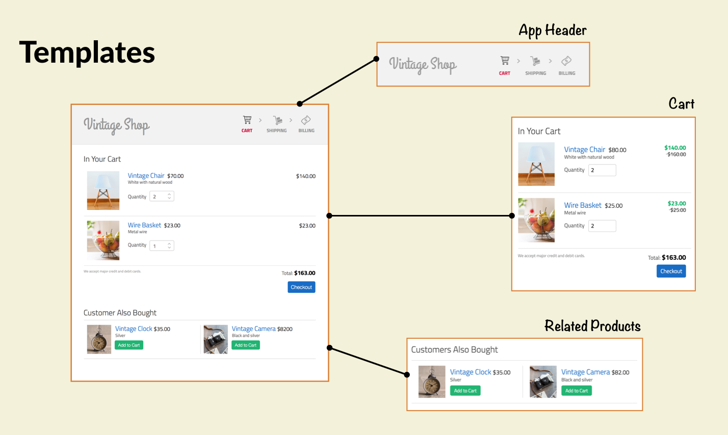
Lastly, there are the templates. In templates, organisms are grouped to form pages. At this stage it’s easy to visualize the organisms from our sample design and see how they compose each of the pages. But not only that, you can image how breaking your designs into these parts can help you establish better design rules, and be more conscious about when and why you would want overwrite those rules.
The missing piece here is a way to document the modules that have been identified. This is not only a matter of creating an specification document to capture how the modules need to be built, or writing guidelines that capture high-level definitions such as brand colors and font families (which are typical of any standard style guide).
Instead, the documentation needs to be more sophisticated and dynamic, so that when these modules change (and you know they will!), the documentation doesn’t become obsolete. This is exactly where living styles guides come in to fill in the gap!
Now that you have learned how to make your designs modular, the next step is to learn how you can use a living style guide to aid the process. In our next lesson we will explore how to do so.
[wpforo item=”forum” id=”16″]