
Tutorial Progress
What is Style Guide Driven Development?
Lesson Contents
- Definition of Style Guide Driven Development
- Style Guide Documentation Examples
Video Lesson
Written Lesson
As its name indicates, Style Guide Driven Development is about driving the development of a system or application using a style guide. But not only that, it’s also about driving the DESIGN and about using a LIVING style guide: developing components and documenting them in a style guide.
Traditionally, when we think about front end implementation, we think about HTML, CSS, and Javascript. However, Design is also part of it, because this is where the User Experience and the Interface are defined. Putting it simply, Design is the starting point when building an application – so it only makes sense to make it part of the development process.
Using Style Guide Driven Development, designers use a living style guide as the starting point for their designs. Living Style Guides (LSG) are living documents that are generated straight from the source code. In that way, the entire process from design to development centers around the style guide, keeping it consistent and up-to-date.
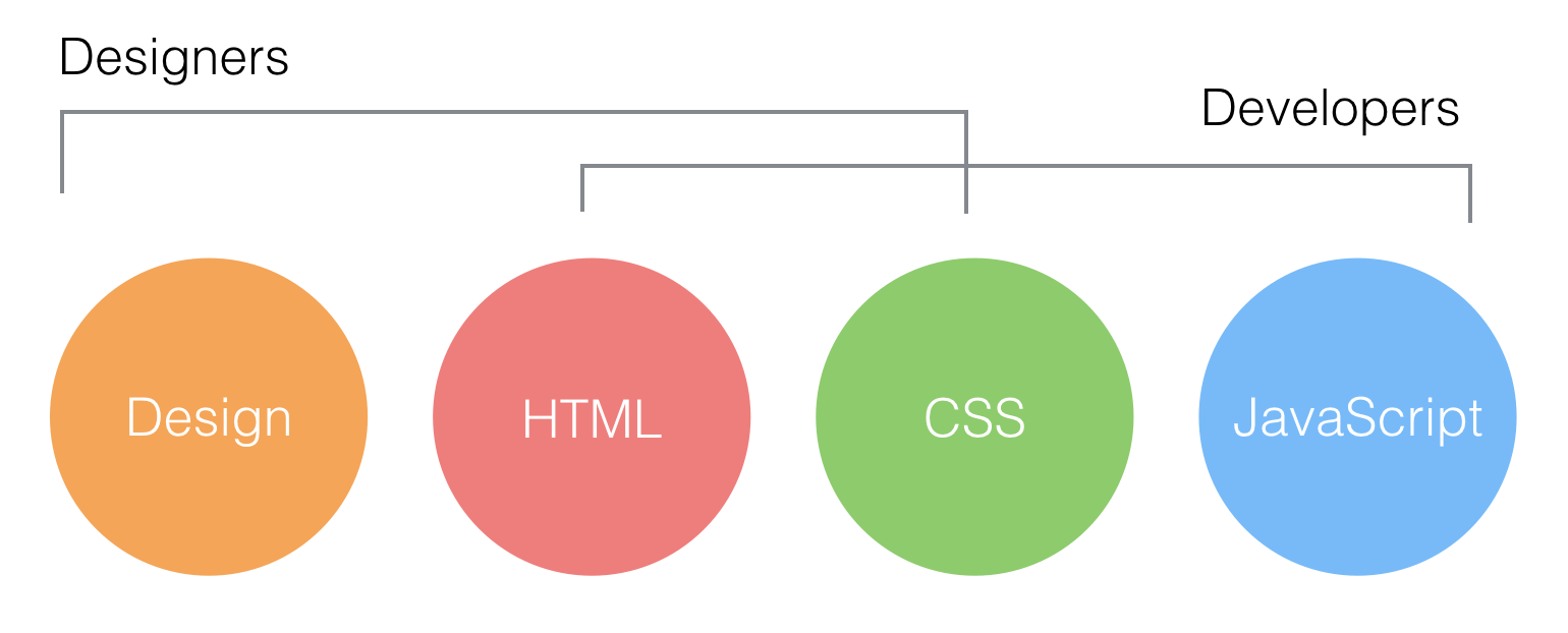
At Bitovi, designers and developers cover these areas of web design (design, HTML, CSS and Javascript), overlapping in the HTML and CSS implementation. And we use Living Style Guides to communicate our designs more efficiently and achieve a more polished product.
Here is a good example: When implementing the following toolbar, as a designer, we would first look at the style guide and bring in the styles that we will be using. We would also learn what design patterns are used currently and create my design based on them.

Then, after multiple iterations, when the design is ready to go and we are ready for implementation, we would create a new page in the application style guide. This would give us a blank slate to write the markup (in HTML) and the styles (in CSS, Less, or sass depending on the project). But it would also give us a framework to work with, because the style guide is connected to the application style sheet. This means that the predefined styles that we used in the design mockups would be available to use in the implementation.
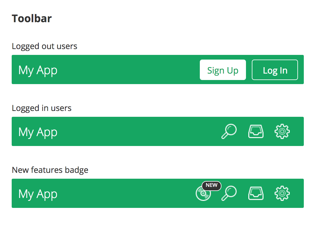
Toolbar use cases
So we can quickly implement our own design, without worrying about messing up with the application (at least not yet!).
Then, we would document the different “cases” or “states” where this toolbar would be used. For instance, how the toolbar looks like when the user is logged out, vs when logged in. Or how the display of new features look in the toolbar.
Bitovi can help you build your app using this methodology. Let’s work together.
This type of documentation is very powerful, because on the one hand you don’t have to recreate each scenario in your app (which can be very time consuming). But also, having these scenarios side by side, allows us to change and try things when implementing and we can see right away the effect that they will have across the different use cases or states.
Now with this document in hand, your dev can move along and take care of wiring things up, scrambling APIs or whatever magic that they do!

That is the gist of what Style Guide Driven Development is. In the next lesson we will delve into Living Style Guides vs Traditional Style Guides.
[wpforo item=”forum” id=”4″]