Modular UI Examples
Lesson Contents
- Responsive Grids
- Tile Windows
- Card Design
Video Lesson
Written Lesson
Good examples of modular UI design can be seen in patterns such as responsive grids, tile windows and card designs. In all of them, modules are used repeatedly to provide a flexible design. In addition, the modules can act as containers as well, providing the ability to insert different types of content and functionality, much like the inserts that can be added to an IKEA cabinet, as we explored in previous lesson. Let’s take a closer look:
Responsive Grids
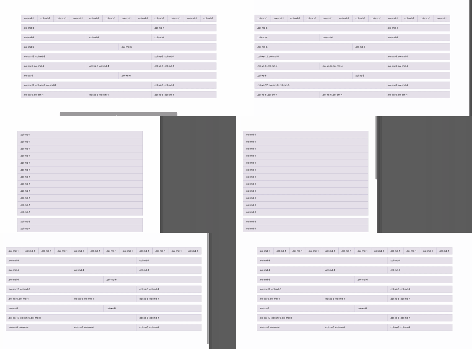
Responsive grids are used to lay out web pages, so that the content can adapt to different screen sizes. Now, how does this work? The grid, is a system comprised by two kinds of modules: rows and columns. Rows are preconfigured to take 100% of the width of the screen and are used to group columns vertically. Columns are mean to be contained by rows and can be configured to a set of predefined values, which determine the space they should take in the screen.

When assembling rows and columns inside of a grid system, modules work together forming slots where content can be placed. If the screen is resized these, modules reorganize themselves and allow the content to adapt to the new size the slots have taken, making them “responsive”.
Tile Windows
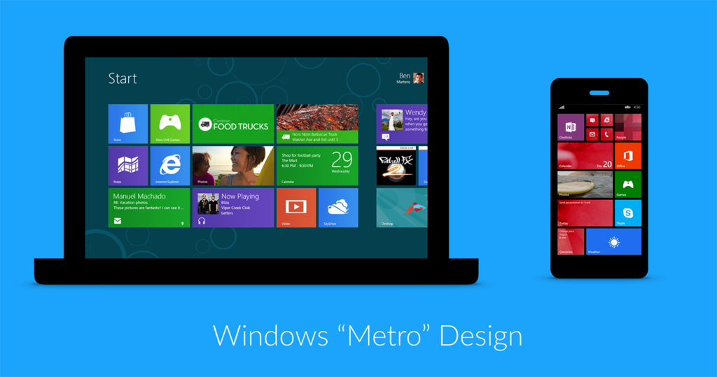
Popularized by Windows Metro design, this User Interface (UI) pattern uses a grid as basis as well. But in this case the grid is divided into modules that are proportional to each other, allowing for more dynamic layouts that break the uniformity of rows and columns.

Also a couple of rules apply to the modules: One, they can only be configured – in this case by the user – to a predefined size – small, large, and medium. And two, the user can also choose the type of content to display on each module. This can be either just a graphic, dynamic content, or a combination of the two. As a system, you can observe how the type of graphics, colors and sizes of the module, play along together. But each one represents a different application, in most cases built independently.
Card Design
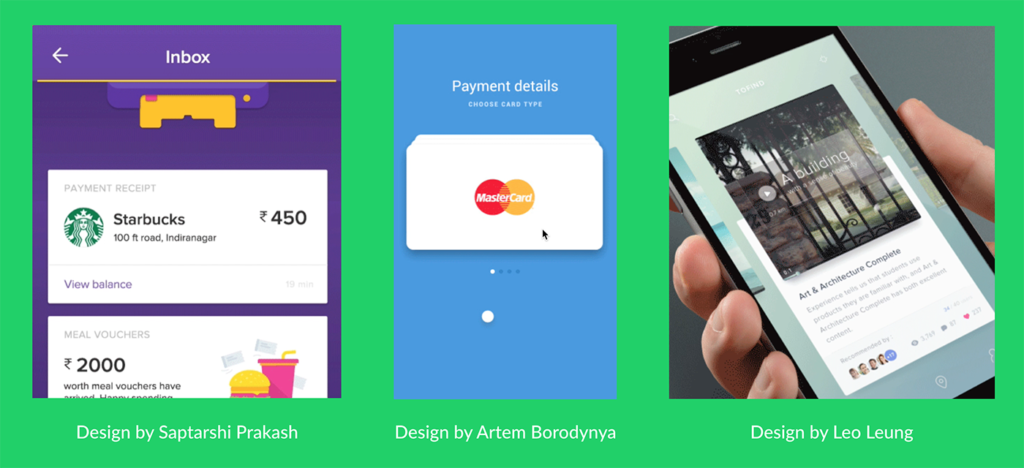
The card design consists of a container, the card, and parts that fit inside this container, which are the modules. Similar to the tile windows design, certain rules apply to how and what type of content is shown inside of the card. The difference however, is that the card itself can become a module and as such it can be displayed in different type of layouts.

Design Credit: Saptatshi Prakash, Artem Borodynya, and Leo Leung.
From this perspective card designs are very adaptable, because they can be “turned over” to reveal more content, they can also be folded, stacked, sorted, grouped, you name it. Some popular examples that use card designs are Pinterest boards and the live feeds like the Facebook’s. These two show cards configured on different ways – in a masonry layout vs a stacked layout – and the different types of interactions that a card can contain.
Now that we have explored different UI designs that are modular, let’s continue to the next lesson to discuss Modular vs Homogenous Design, and how creating modular designs should not be a limitation for creating unique and innovative solutions.
[wpforo item=”forum” id=”2″]

