Implementation & Documentation Phase
Lesson Contents
- Developing components in isolation
- Documenting as part of the implementation
Video Lesson
Written Lesson
In this part of the process the living style guide becomes both a framework and a playground – this is reason #1 for using Style Guide Driven Development!
It’s a framework because it provides the rules that define how elements should look and behave. Creating the new component, is about following the guide to make it fit as part of a whole, while providing enough flexibility to reuse it in different scenarios.
It’s a playground because it’s a blank canvas where you can dedicate attention to the one component that you are building and play with it to see how it behaves in different scenarios. This provides a great way to test flexibility and reusability.
This is the moment when, as a designer, you can play with the design right in the browser, tackling any inconsistencies or gaps that were not visible before when working on mockups or prototypes. And if you are a developer, you can unit test as you develop, since you are focused on building just one component.
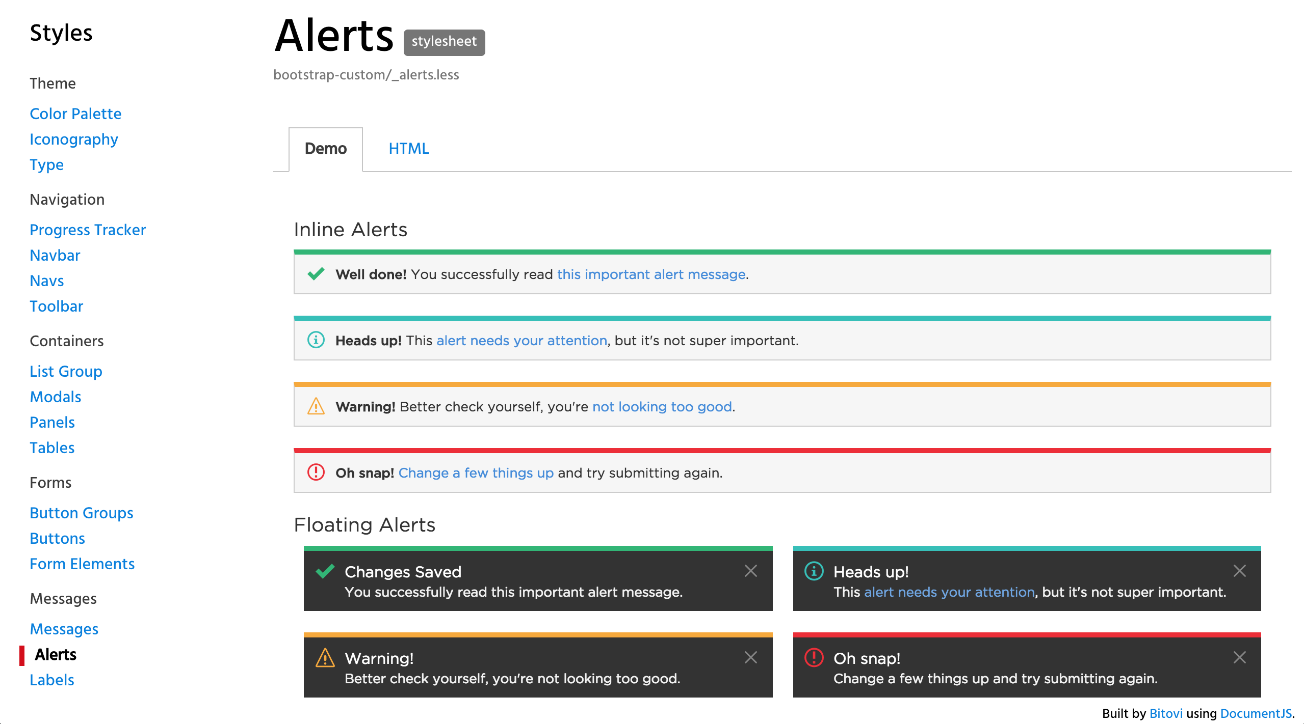
While the implementation takes place it’s a good time to also start documenting. And when doing so, it’s a good practice to include the multiple use cases where your component can be used. In this example the different types of alerts are documented side by side, so it’s easy to know the different “flavors” that are available.

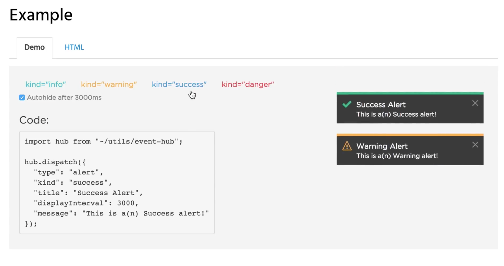
Living style guides shine as documentation tools, as they make it easy to include information to describe how the components work alongside code samples, interactive demonstrations, and the configurable parameters that are available.
It’s important to highlight that, up to this point, the development has taken place in isolation from the application, using the living style guide to preview and test. This has the great advantage of eliminating unintended dependencies since the only elements that you will be working with are the component that you are building, the application baseline CSS, and any other components that you want to bring in.

Example of a UI component
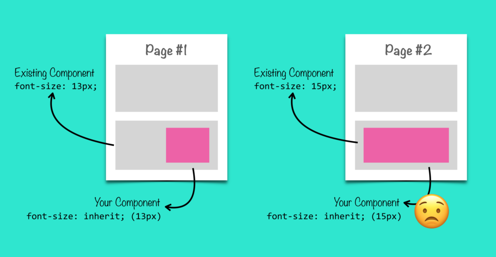
Picture this, when you build directly in your application, there are already many elements at play. If something fails, it can become cumbersome to debug and know what is causing the problem. Was it something that you did? Or something that was already there?
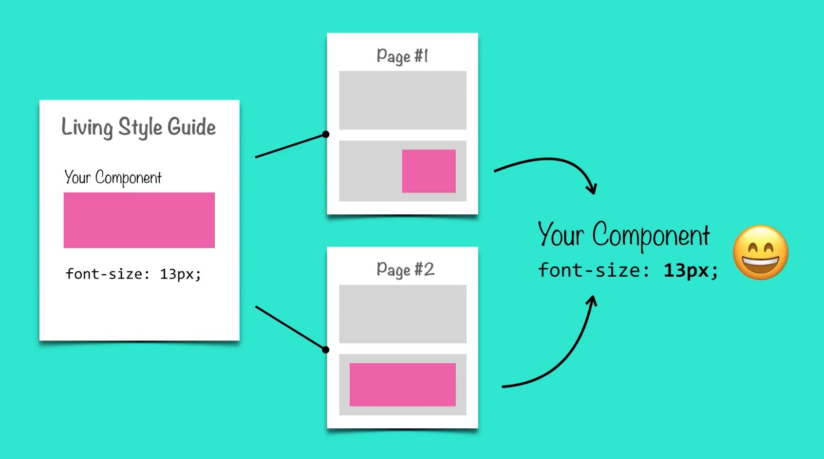
That aside, even if something doesn’t fail, it’s harder to know what’s a dependency and what’s not. For example, another component in the page could be predefining the font size, and maybe this is something that should be defined at the component level so that every time the component is used the correct font size is shown.

Building in isolation with the support of the living style guide framework provides an environment where you can focus on the one thing that you are building, while encouraging to make it reusable and part of the UI system. This improves visual and behavior consistency in the UI, and speeds up the implementation.

Now that the component has been implemented and tested, it is ready for the last phase: The integration phase, which will be talk about in the next lesson.
[wpforo item=”forum” id=”10″]

