Creating a Common Language
Lesson Contents
- Using the living style guide as a communication tool
- Creating a common UI vocabulary
Video Lesson
Written Lesson
As an efficient development workflow, SGDD eases the conversation between different members of the team. New members can quickly familiarize themselves with the patterns in the library, while designers and developers can discuss the design implementation by looking at interactive demonstrations of the UI, instead of getting lost in mockups and prototypes.
Additionally, product owners, testers, and stakeholders can use the style guide to learn about the interactions and behaviours defined in the guide and reference them as needed.
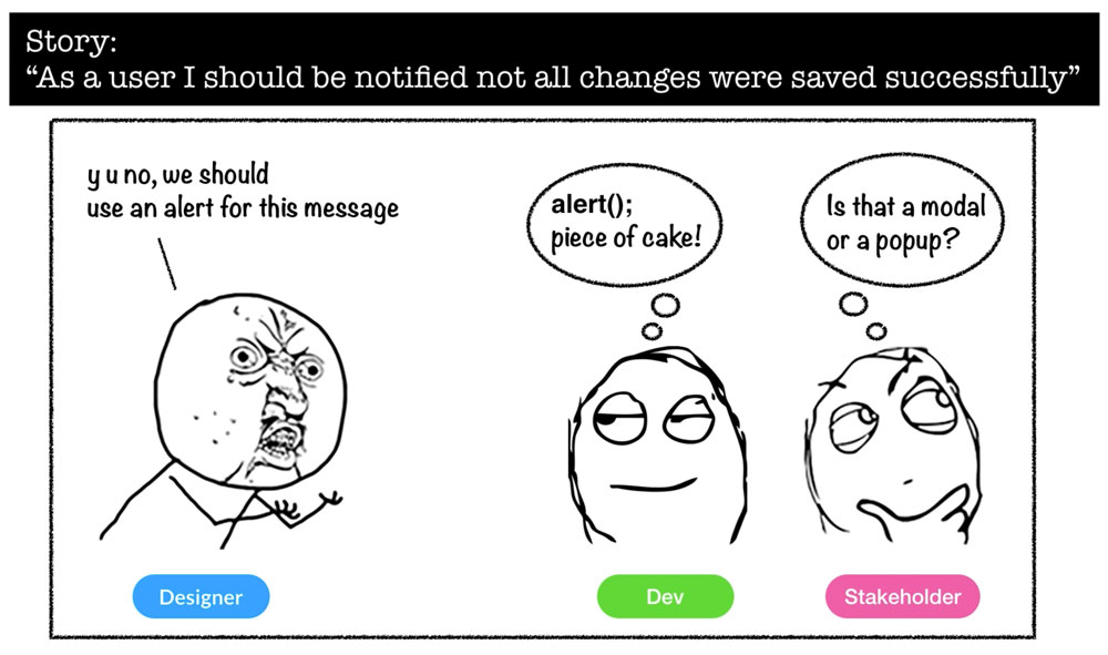
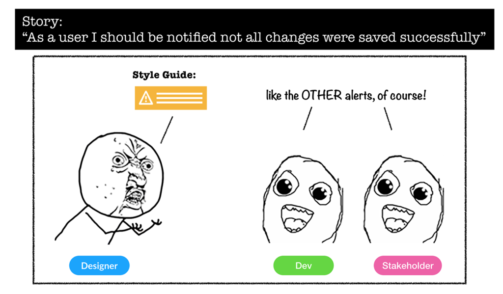
Picture this scenario: You’ve been assigned a simple story about notifying a user that all of the changes he just made were saved successfully.
In your mind it is obvious that an “alert message” should be used. But when you tell this to your dev team, others may have their own ideas of what an “alert message” is. For example, a dev might think that you are talking about a Javascript alert. “Piece of cake!” she thinks to herself. And then on the other side of the room (of chatroom for the matter) a stakeholder is actually wondering if you are talking about a “modal” or a “popup”. He has heard both terms used for showing messages so it’s not clear to him which one you want to use. Does this sound familiar?
This is probably not an uncommon case for many. Building a vocabulary is something that is natural when working on a project in a team environment. Because there are these “things” that we are all building, and we need to call them “something”.
In user interfaces, there is already a vocabulary based on the common elements that are mostly used like: buttons, dropdowns, links, navigation bars, etc. However, even then, a button or something that looks like a button could be called: control, call to action or pill.
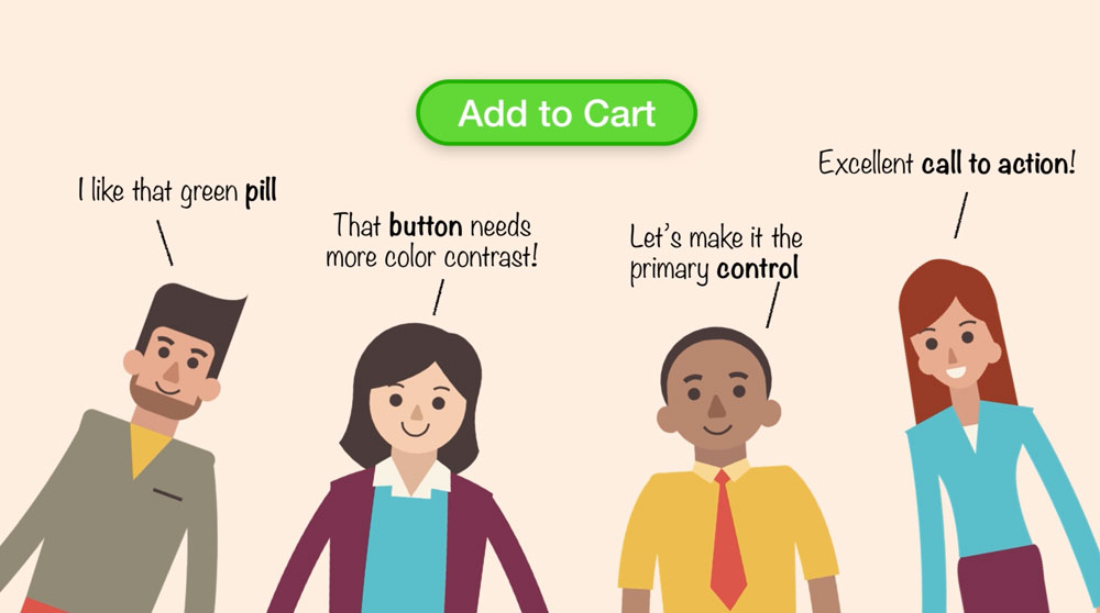
A shared vocabulary for common elements
Now picture how tricky communication can get as your UI grows and there are different kinds of buttons, popovers, and modals used throughout. This is when living style guides can come to the rescue, facilitating as a team how things are named, and have a common place where everybody can find information about it.
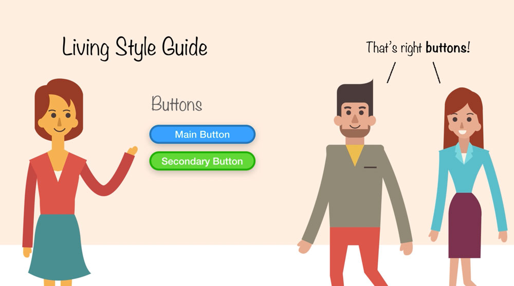
With a living style guide you can quickly show everybody what you are talking about
Going back to our scenario, armed with a living style guide you can quickly show everybody what you are talking about: ‘A yellow warning alert message already coded and documented in the living style guide’. Then everyone realizes those alerts have been used before and besides keeping consistent the interactions in the app, they can also save work in the project as they have already been developed.
Creating a living style guide is also about creating a common language for your User Interface. As this glossary is created, it is important that the team is aware of where it is and have an opportunity to participate in the creation of the vocabulary. A good time to do this is during the Abstraction Phase, when designs are being broken down into the implementation stories. As your team reviews the new components that you will be creating, you can talk about how to name them and even use those names in the stories that will be used during the sprint. In this way from the beginning everybody is on the same page, calling things they way you all agreed to.
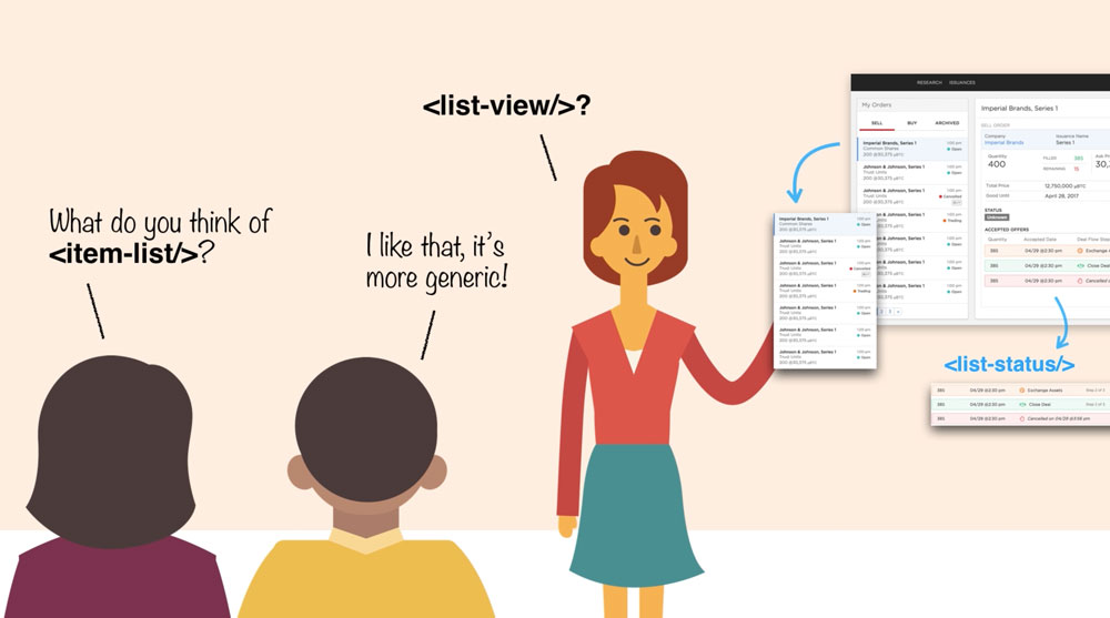
Create a common language for your UI
Now that you know how you can hone in creating a common language for your UI as part of Style Guide Driven Development, let’s move on to talk about our last topic: Centralizing Documentation.
[wpforo item=”forum” id=”12″]

